Chartist’s Heaven- Analysis Till Paralysis?

While I am not a technical analyst by profession nor a great believer in it, I think that there are some merit to it because underlying it all it is a way to look at trends which could be indicative of mass psychology of all investors/speculators etc.
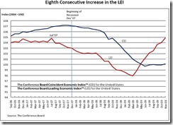
Also, one chart that I check once in a while is the Conference Board Leading Economic Indicators as a steady decrease over time or increase is one pretty good indicator of an impending turn in the economy. At the last release of this indicator, it shows an eighth consecutive increase.
As I don’t believe in market timing, I don’t buy nor sell shares or positions based just on charts.
But when the charts plus the fundamental data (both economic and financial) points to something, you start paying more attention and either cull your stock holding a bit or be a little more aggressive in buying stocks.
If you have good stocks, you hold on to them, but those you aren’t too sure of, it could be time to look intently at them to see if you need to sell those position or reduce it.
I think the economy is at a point of inflexion. Markets are not very undervalued, nor are they overvalued. This is the time when I like to think is time to accumulate bits and pieces slowly like an art collector.
You’d need to analyse it more as the chances of screwing up is higher unlike at the opposite ends of the market- when it is more clear. That’s why I like Dollar Cost Averaging as it simplifies matter and make my headache of what to invest and when to do it go away.
If you over analyse and think too much, eventually, you end up doing nothing.
It’d be interesting when the Conference Board releases their next report on 21 January 2010. Would the red line continue its climb up at the same gradient or will it slow down?
Related Posts
Disclaimer
reliance placed on information provided in the blog.
Shares and financial instruments illustrated in this blog can go down sharply or in certain instruments suffer total loss on the initial investments. Investors are advised to make their own judgment on the information provided and consult their own financial advisors or consultants as to the suitability of the products illustrated to their particular financial needs and objectives before acting on any information contained herein in this blog.


Post a Comment