Sadly, the site does not support Singapore stocks at the moment, even Straits Times Index, STI index etc did not return any results. So hopefully, the people there are indexing and processing information from Singapore soon.
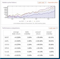
The example for stock comparison in their site is quite an apt example. It looks at the IT behemoths- Microsoft, Apple and Google. A screenshot of what you will see is on the second image below here:
This allows you to look at the stats and graphs for the stocks that you want to compare. It presents it succinct and rather sparse way which cuts away other information. So it may only be useful in a very superficial first look at a company you may be interested to monitor and use this tool as the scalpel to cut away those that don’t measure up.
When you look at the three titans fighting it out in cyberspace, you see that they are all holding out and the battle is nicely poised for the next phase- whatever it may be.
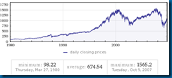
I managed to get 30 years worth of data from the site and it generated this simple chart to show the rise and fall of the S&P500 for the past 30 years in a nifty.
Do check out the site, especially if you look at overseas stocks in the USA or buy into major indices as part of your investment portfolio.
Source: www.wolframalpha.com


No comments:
Post a Comment